The challenge wasn’t fitting procurement opportunities onto a page. It was designing a system people could actually navigate.
Doing business with a city can be complicated, especially for a small business encountering the public procurement process for the first time. While working with the City of San Antonio Economic Development Department in 2020, I was given the opportunity to help make that process a little easier to navigate.
Under the direction of an Assistant Director overseeing the Small Business Office, I led the creative development and design of what became the City's FY2021 Annual Procurement Guide. The publication grew out of San Antonio's Five-Year Diversity Action Plan and was created to give local small, minority, women, and veteran-owned businesses advance notice of planned City solicitations, giving businesses more time to prepare, pursue prime contracts, and identify subcontracting opportunities.
The information itself was inherently complex. Hundreds of potential contracting opportunities had to be organized alongside estimated values, release dates, solicitation methods, subcontracting opportunities, procurement programs, vendor resources, and instructions. My challenge wasn't to make that complexity disappear. It was to design a system that made it easier to navigate.
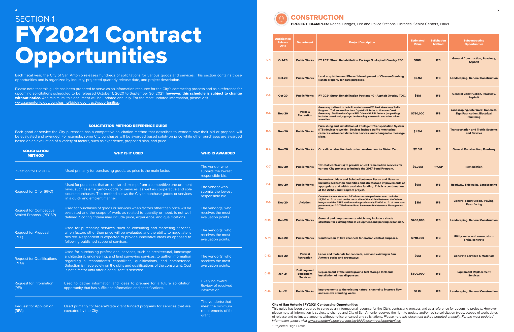
The Framework
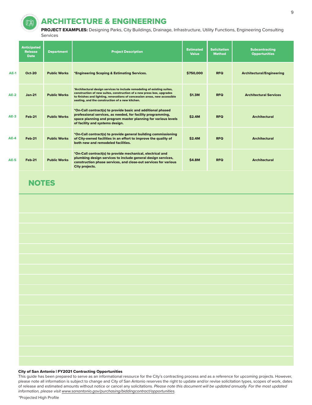
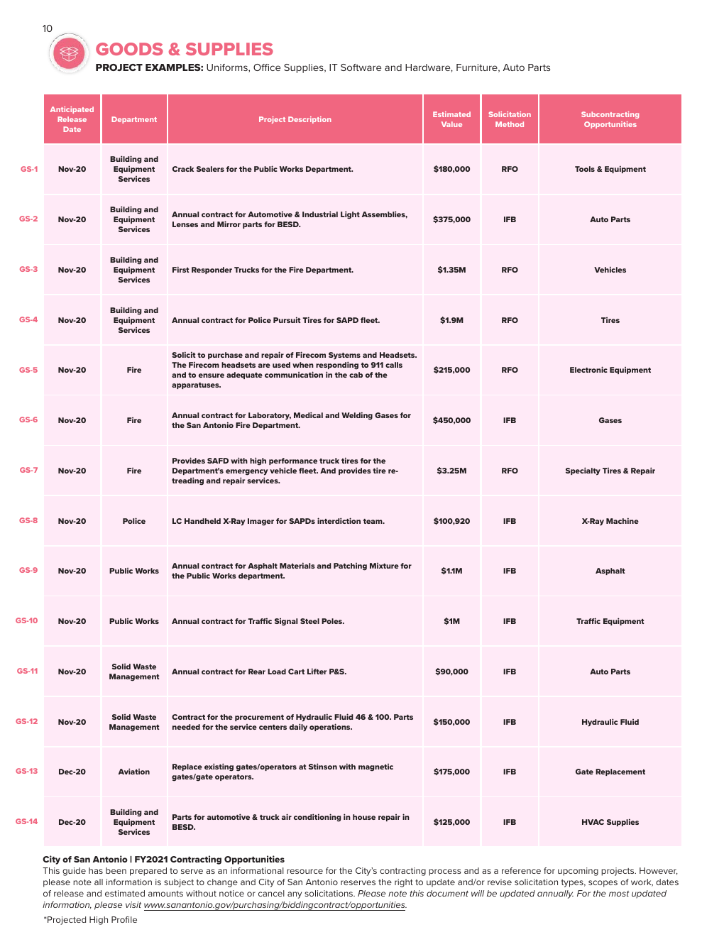
I developed a visual framework that divided contracting opportunities into distinct industry categories, each with its own color identity. Construction opportunities, for example, appear in orange, while professional services use teal, allowing readers to visually recognize when they had entered a new category without having to relearn the structure of the page. Within those sections, I created a repeatable table system that gave consistent placement and hierarchy to release dates, departments, project descriptions, estimated values, solicitation methods, and potential subcontracting opportunities.
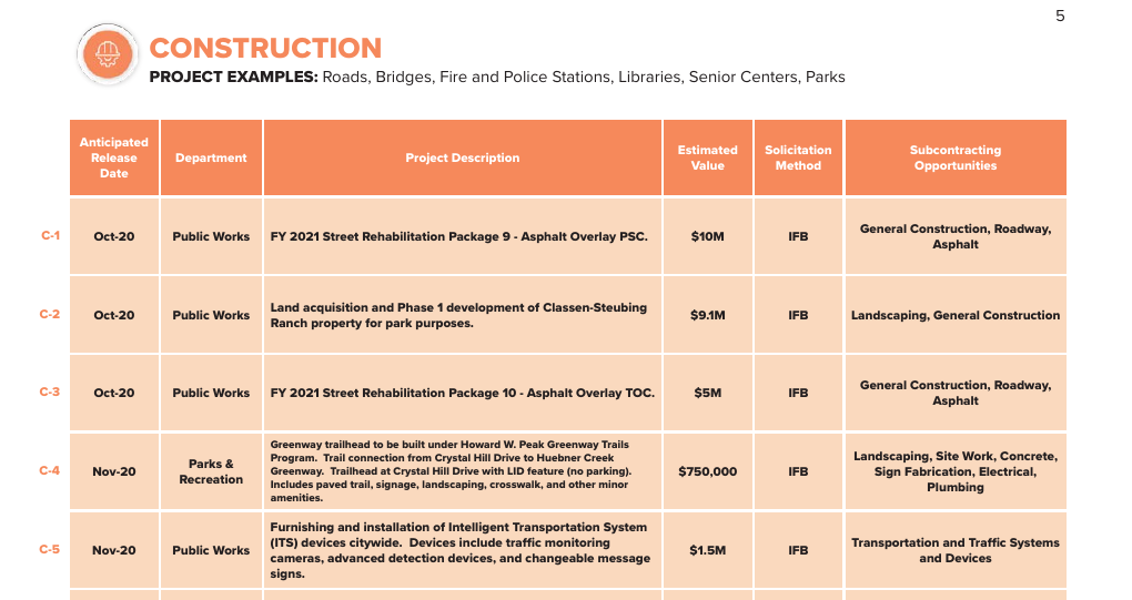
I also created a unique identification system for every opportunity in the guide. Codes such as C-1 for Construction and PS-15 for Professional Services paired an abbreviated industry category with an individual project number. That gave each opportunity a concise reference point that could be used when navigating the publication or discussing a specific project with City staff.

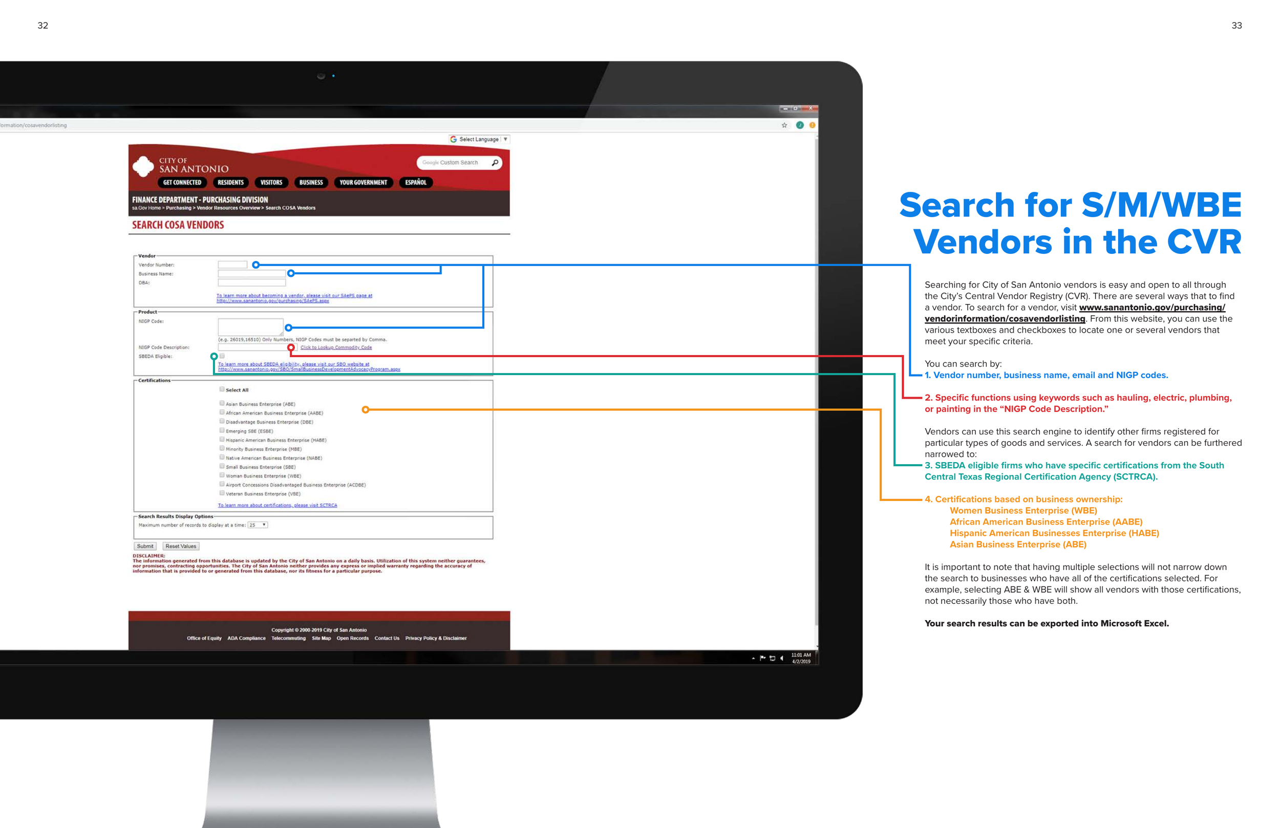
Beyond the contracting tables, I wanted the publication to feel like a guide in the fullest sense of the word. I developed large typographic section openers, visual reference tables, numbered callouts, maps, icons, and instructional layouts to break complicated procurement concepts into more digestible pieces. A restrained use of the City's blue created continuity across the publication, while photography and large-scale typography gave major sections room to breathe between information-heavy pages.
The cover established that approach immediately. Rather than representing procurement through a single industry, I created a collage of imagery spanning construction, professional services, maintenance, automotive work, landscaping, and other types of work represented within City contracting. It helped visually communicate that procurement isn't one kind of business. It encompasses an enormous range of services and industries.
Just as importantly, the guide didn't stop at showing businesses what opportunities existed. Later sections explained procurement processes, preference programs, vendor registration, department contacts, and additional Small Business Office resources. The design therefore had to accommodate both quick-reference information and more detailed educational content within one cohesive publication. The finished guide ultimately spanned dozens of pages and served as both an opportunity forecast and an introduction to navigating City procurement.
What makes this project particularly meaningful to me is what happened after my original design was completed. The FY2021 guide wasn't treated as a one-time publication. The City continued producing Annual Procurement Guides in subsequent years, carrying forward the fundamental organizational framework and visual system established in that first edition.
For me, it became an early lesson in the difference between decorating information and designing information. The success of the project wasn't dependent on making procurement look exciting. It was about creating hierarchy, consistency, and visual cues that could help someone make sense of a complicated system.